Shoppable campaign landing page
·
2026
A premium editorial eCommerce campaign created to support the SS26 launch and connect seasonal storytelling with product discovery. Designed for Hawes & Curtis to turn campaign imagery into a richer, shoppable experience across desktop and mobile.
Hawes & Curtis
·
CRO & UX Lead / UX & UI Design
Overview
I designed and built an editorial commerce page that brought the collection to life, carrying the campaign feel through the full journey, from the first image through to product discovery. The aim was to make the page feel premium, considered and easy to explore, without rushing customers straight into a hard sell.
The page connected campaign imagery with shoppable moments in a way that felt natural. Product details, colour options and multibuy messaging were introduced at the right points, helping customers understand what was available without interrupting the editorial flow.
At a glance
Client
Hawes & Curtis
Role
CRO & UX Lead / UX & UI Design
Focus
Editorial commerce · Product discovery · Campaign storytelling
Tools
Figma, GA4, Hotjar, custom CMS, stakeholder collaboration
Output
Responsive lookbook experience
Year
2026
Disciplines
Editorial Design, eCommerce, Campaign, UX Design, UI Design, Product Discovery
Status
Live: www.hawesandcurtis.co.uk/ss26-lookbook
Context
The SS26 Lookbook needed to feel polished and campaign led, but it also had to work hard as part of the shopping journey.
Rather than creating a page that simply showcased nice imagery, I wanted the experience to give the collection more room to breathe while still guiding customers towards the products behind the campaign. It was about finding the balance between brand storytelling and clear, useful commerce.
01
The challenge
The risk with a campaign page is that it becomes a nice visual moment, but doesn’t really help the customer go anywhere next.
For SS26, the aim was to make the Lookbook feel useful without making it feel overworked. It needed to give the collection space, keep the experience sharp and considered, and make the route into shopping feel clear without forcing it.
02
What it needed to do
01
Present SS26 as a cohesive editorial campaign story
02
Connect seasonal inspiration with product discovery
03
Create a premium, responsive lookbook experience
04
Encourage onward journeys into PDPs and shopping paths
03
My role
As CRO & UX Lead on the project, I shaped the experience end to end and worked closely with marketing, merchandising and development to bring it to life.
Led campaign page and editorial layout design
Defined the visual hierarchy and journey structure
Connected campaign storytelling with product discovery
Partnered with marketing and merchandising on content and product priority
Worked with development to ensure faithful, performant delivery
Reviewed the experience post-launch using GA4 and behavioural insight
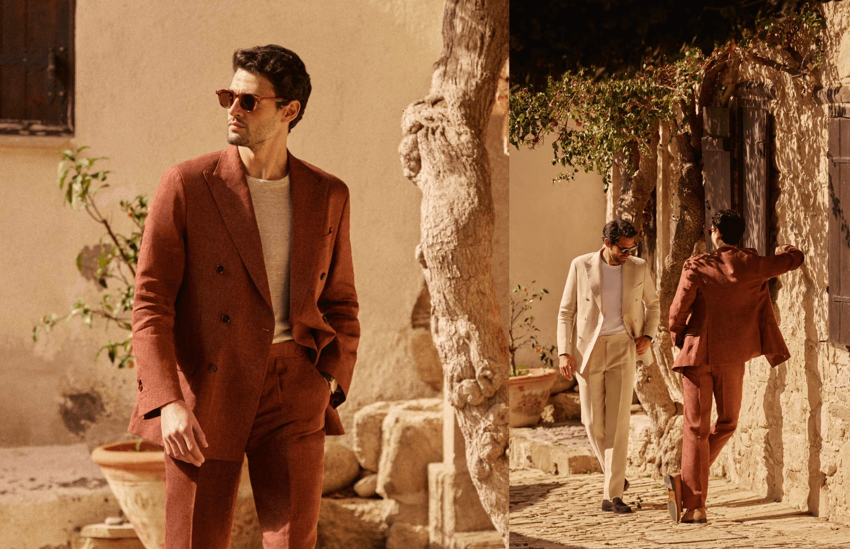
Visual showcase
The design, in context
www.hawesandcurtis.co.uk/


Responsive
Considered on every screen
Desktop ·
Mobile ·
Commercial thinking
Turning campaign storytelling into product interest
Editorial and commerce were not treated as opposing forces. The storytelling was designed to actively support product journeys, not distract from them.
Campaign storytelling was structured to lead naturally toward product interest
Product information was surfaced at the moments it genuinely helped decision-making
The layout encouraged deeper browsing rather than a quick bounce
Every UX choice aimed to serve both brand perception and conversion intent
06
Outcome
The experience read as a single, considered editorial story rather than a set of disconnected modules.
A stronger, more cohesive presentation of the SS26 collection
A clearer campaign journey from inspiration toward product interest
A closer connection between campaign imagery and product discovery
A layout system designed to support click-through into product journeys
A responsive experience that held up consistently across desktop and mobile
Early post-launch analysis showed positive engagement signals, with users continuing from the Lookbook into PDPs and lower-funnel shopping journeys. I’ve kept the public version deliberately high-level to avoid exposing internal performance data.
07
What I’d improve next
Given more time, I would push the personalisation of the discovery hand-off further, tailoring which products appear based on the part of the campaign story a customer engages with most.
I would also introduce more detailed tracking around product interactions, panel opens, scroll depth and product clicks, so the experience could be optimised with stronger behavioural evidence.
More tracking around key interaction points
More experimentation with product placement
Stronger personalisation of the discovery hand-off
Clearer testing around which campaign moments drive the strongest product intent